Race Charts
Race charts are animated, dynamic visualizations that are best suited to show the relative ranking of categories over a period of time. They highlight and help understand the fluctuations and progression in the data. These types of charts grab the user's attention instantly, providing an immersive experience and helping craft an immersive story about the data.
On this Page
Zoho Analytics supports the following three variations of a Race chart:
Race Line Chart: In a Race line chart, multiple lines move dynamically showing how each metric progresses over time. This type of chart is ideal for continuous data points. It enables you to observe trends and fluctuations as the lines move according to the change in values.
Race Bar Chart: In this, the bars move horizontally, changing positions based on the values at each time interval. The length of each bar dynamically adjusts according to the data for that specific time period, reflecting the magnitude of each category. This type is best suited for comparison based on ranks.
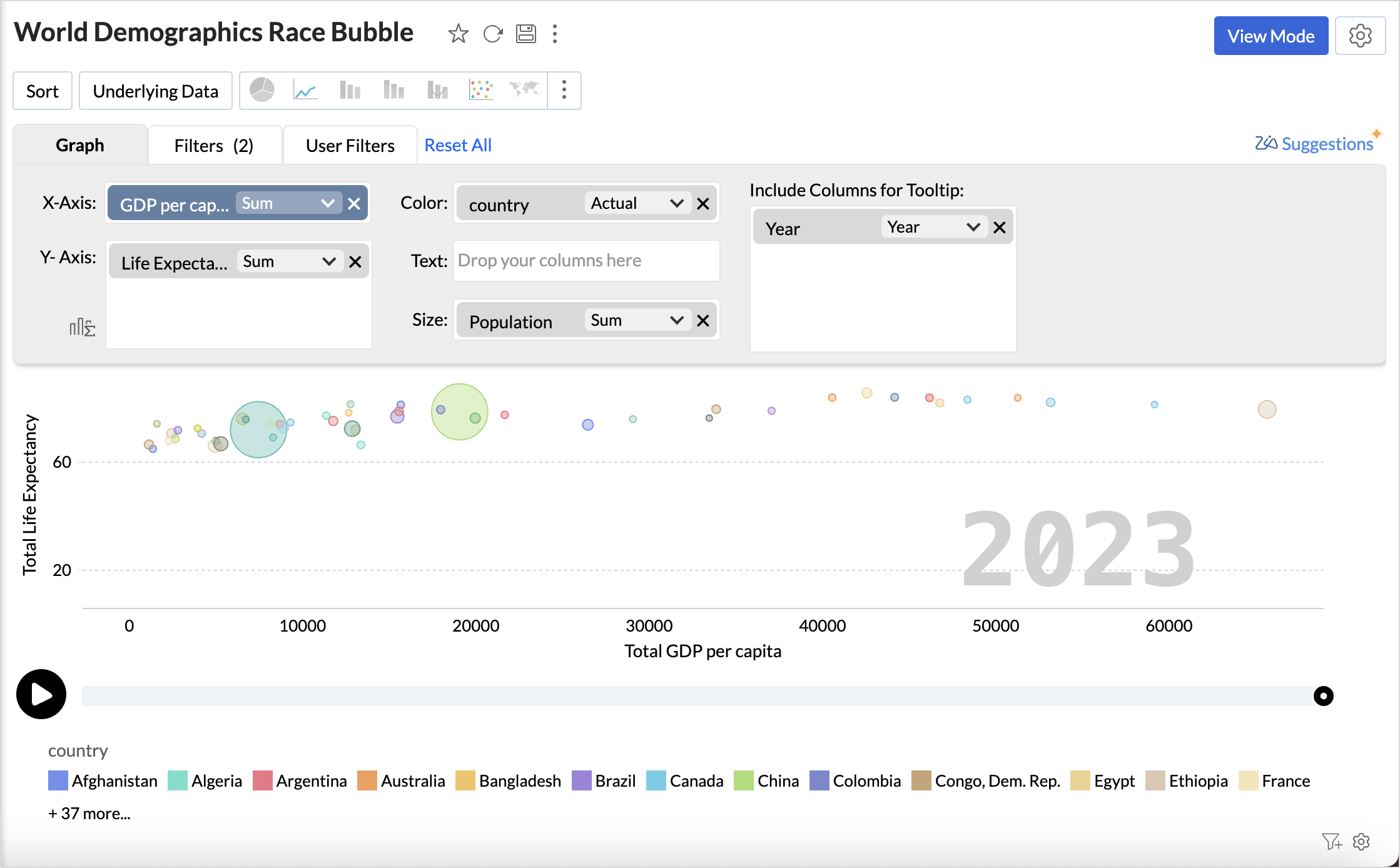
Race Bubble Chart: In a Race bubble chart, each bubble represents a category or dimension. The bubbles move based on the two measures plotted on the X and Y axes. The size of each bubble varies according to the value of a measure represented on the size axis.
Data Requirements
A minimum of two-dimensional columns and one measure column is required to generate a Race chart.
Creating a Race chart
- Access the table for which you want to create the chart.
- Click the Create icon on the side navigation panel and choose New Chart View from the drop-down menu.
- In the chart editor, add the columns as given below
- X-axis: Add a dimensional column (date) with the appropriate sub functions.
- Y-axis: Add a measure column.
- Color: Add a categorical or dimensional column.
- Click Generate Graph.
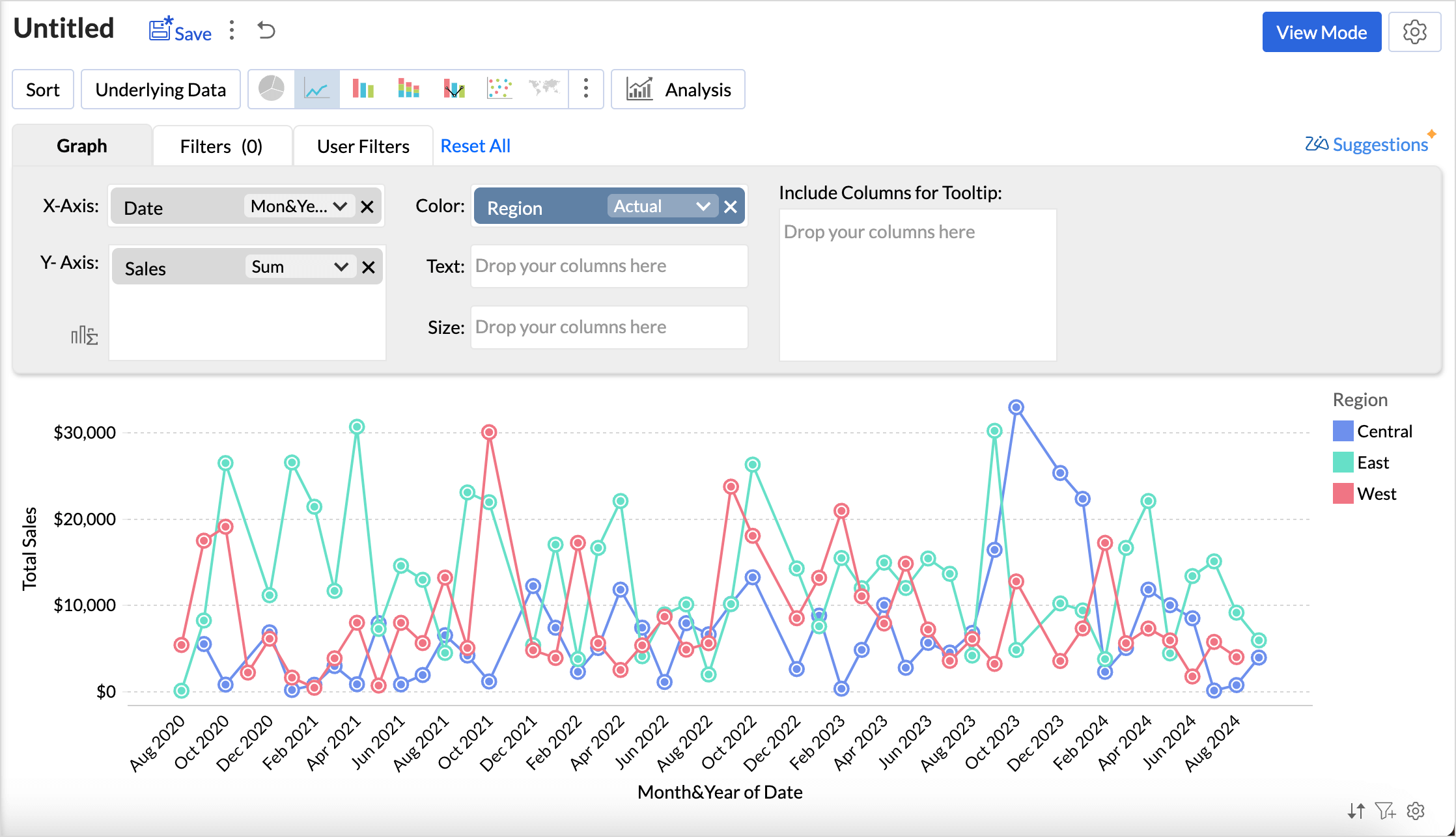
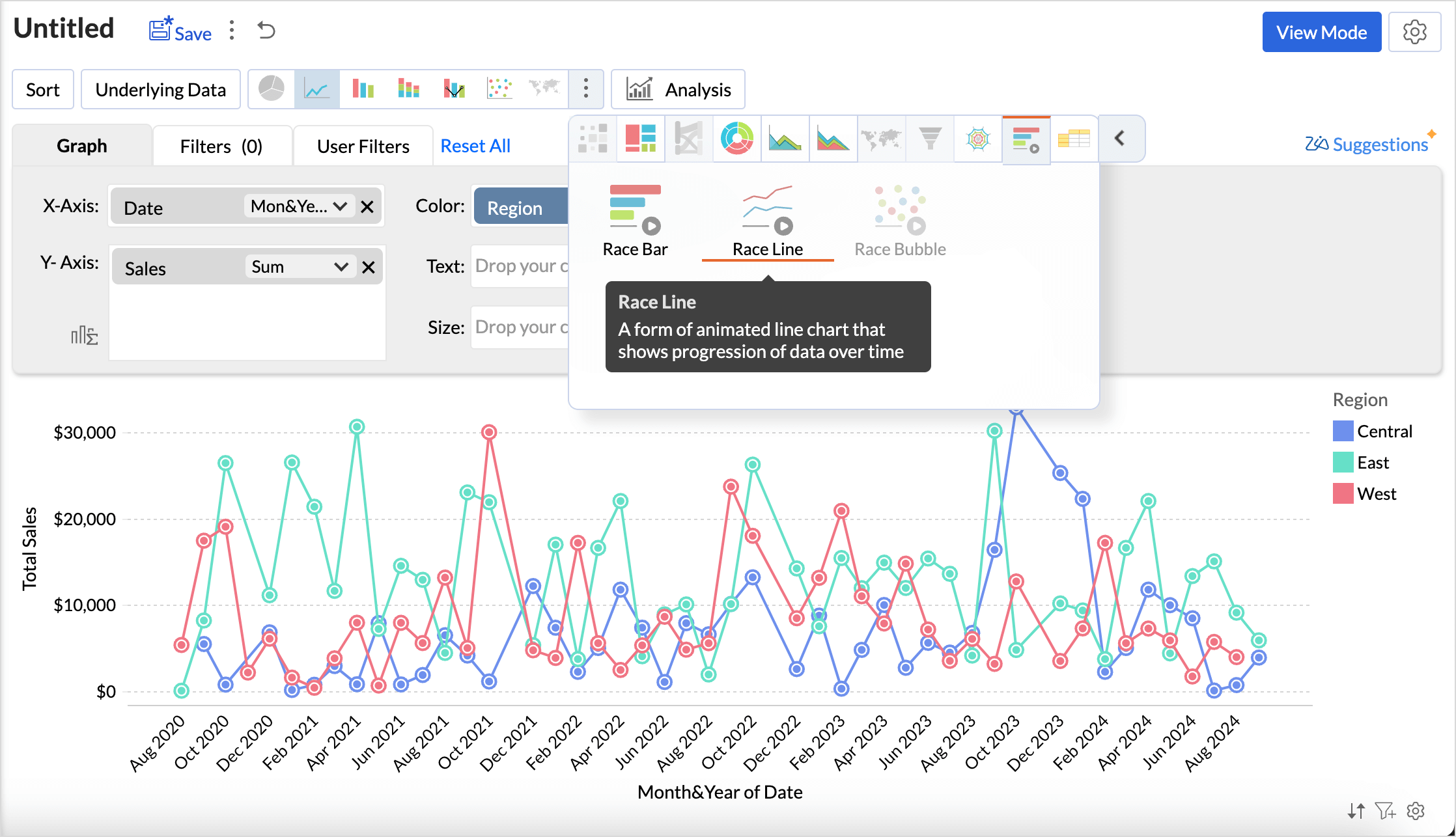
- A simple line chart will be created as shown in the above image. Click the more icon of the chart types and choose Race Line Chart.
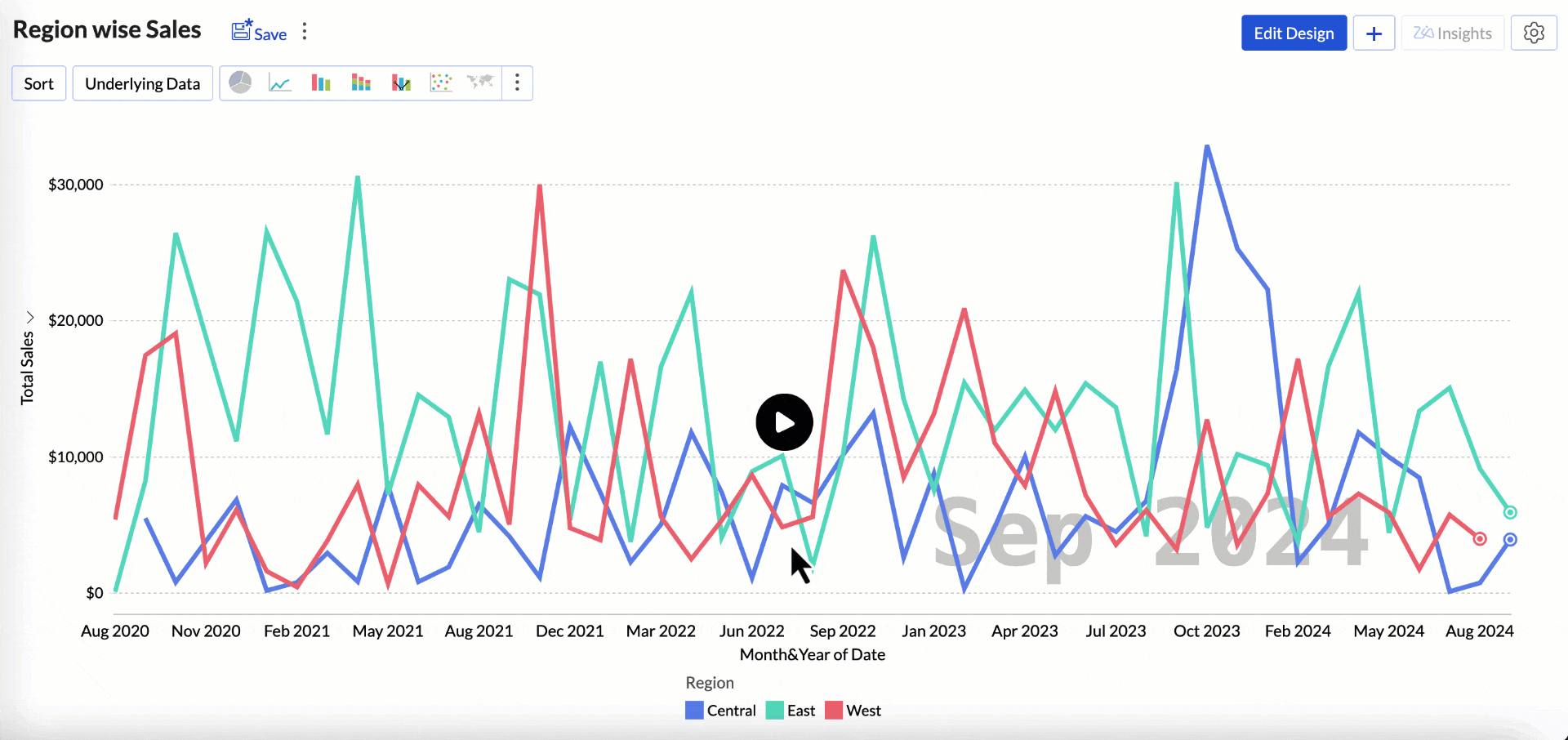
- Access the View Mode; click the play button at the bottom to view the animated chart.
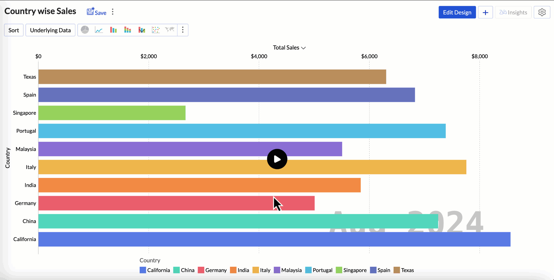
The GIF below displays the country-wise sales of a company as a Race bar chart. The chart creation process follows the same steps outlined above. Select Race Bar Chart as the chart type.
Creating a Race Bubble Chart
- Access the table for which you want to create the chart.
- Click the Create icon on the side navigation panel and choose New Chart View from the drop-down menu.
- In the chart editor, add the columns as given below
- X-axis: Add a measure column with summary functions.
- Y-axis: Add another measure column with summary functions.
- Size: Add a measure column. The size of the bubble changes based on this field
- Tool tip: Add a dimensional column like date.
- Click Generate Graph.
- Click the more icon of the chart types and choose Race Bubble Chart.
Customizing a Race Chart
Zoho Analytics offers extensive options to customize any chart. This section explains the customization options specific to the Race chart. Refer to the Customizing Charts article to learn more.
- Click the Settings icon in the top right corner.
- Click the Race tab.
- The Race Speed option allows you to adjust the slider to increase or decrease the speed of the chart. You can also specify the speed value in the Race Speed field.
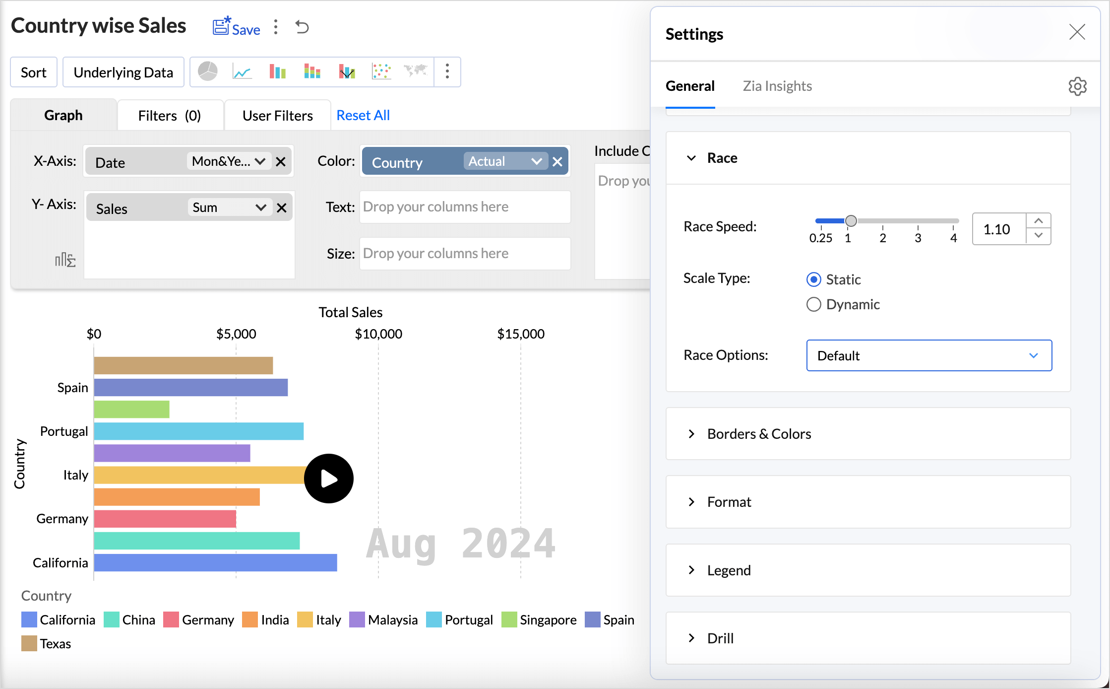
- Scale Type determines how the axis adjusts during the animation.
- Static: In this, the axis range is fixed throughout the entire animation, and the values change only within the specified tick marks.
- Dynamic: In this, the axis range adjusts dynamically as the values change over time. The scale is recalculated at each frame to fit the current data.
Race options allow you to choose the chart controls to be applied, including the slider and overview effects.
- Race options allow you to choose the chart controls to be applied, including the slider and overview effects.
Possible Combinations
| X-axis | Y-axis | Color | Text | Size | Tooltip | |
| Case 1 | Dimension (date) | Metrics / Aggregate | Dimension | - | - | - |
| Case 2(Bubble Chart) | Aggregate | Aggregate | Dimension | - | Aggregate | Absolute Date (Month & Year, Actual Date) |