Visuals in Pivot
Pivot table offers you the following visualization options to enhance data representation.
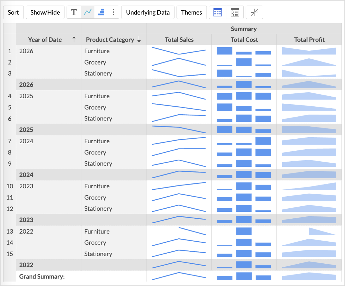
Sparkline Charts
Sparklines are compact, multi-point visual charts that show the trends and variations in the data, without taking up much space. They are widely used alongside pivot tables and help grasp trends and insights quickly.
For instance, spark lines can be used to visualize the trend of sales figures, expenses, or other metrics across different categories or time periods.
Zoho Analytics supports three types of sparkline charts:
- Line
- Bar
- Area
Adding Sparkline Charts to the Pivot Table
- Drag- and-drop the required fields to the columns, rows and data shelves.
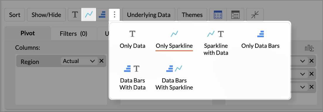
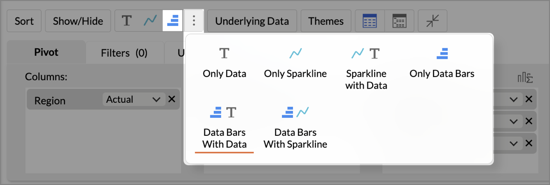
- From the toolbar, click the Sparkline icon or open the More options (⋮) menu.
- Choose any one of the below options from the drop-down menu.
- Only Data - This is the default case, where only the data is generated according to the columns dropped in the designer shelf.
- Only Sparkline - The data trends of the selected columns alone are shown in the report.
- Sparkline with Data - The data trend and the data are shown in the report.
A pivot table with a sparkline chart will be created, and a tooltip will be displayed on hover to view the datapoints.
Customizing a Sparkline Chart
Follow the steps mentioned below to customize the sparkline chart
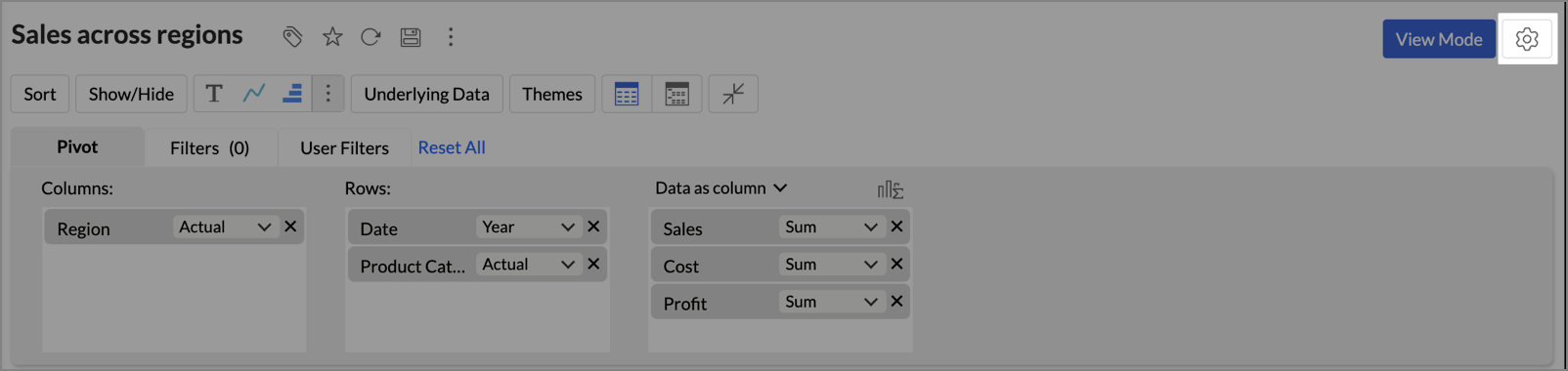
- Click the Settings icon at the top right corner.
- Open the Sparkline tab.
- In the Sparkline section, choose the Chart Type to apply to the data column.
- Choose the Color for the sparkline charts.
- Specify the Sparkline Cell Height.
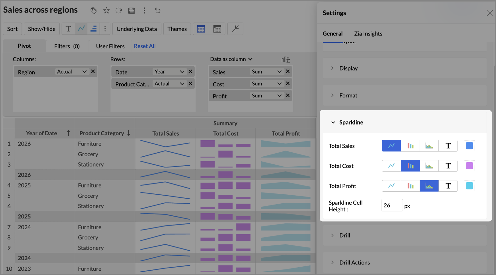
After you apply the changes, the pivot table updates to reflect the customization.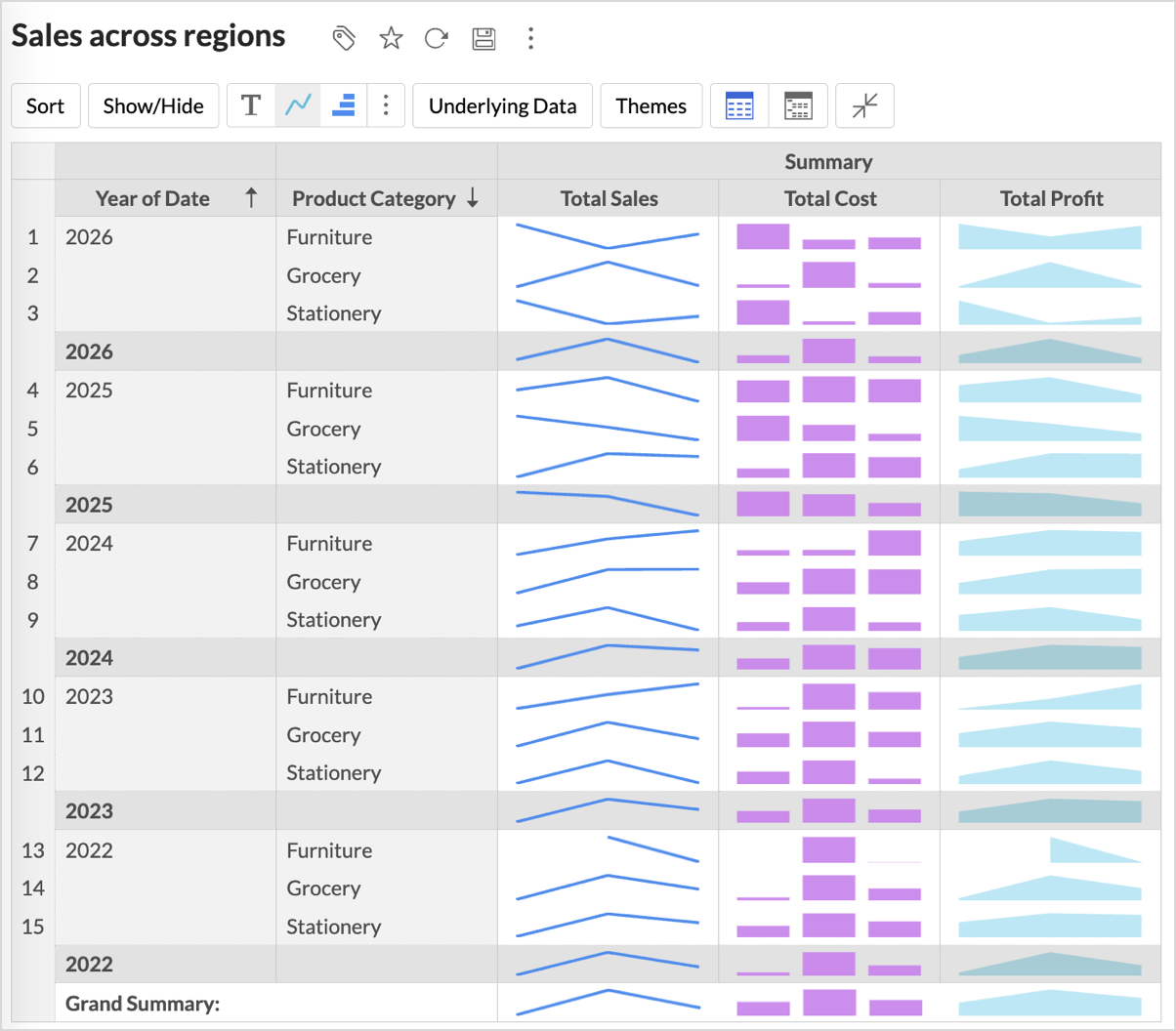
Data Bars
Data bars are single-point visual elements that help you quickly compare and analyze values within your data. These bars appear directly into the cells, providing an intuitive indication of relative value, making it easier to spot trends, outliers, and patterns.
Adding Data Bars to the Pivot Table
- Drag- and-drop the required fields to the columns, rows, and data shelves.
- From the toolbar, click the Data Bars icon or open the More options (⋮) menu.
- Choose one of the following options from the drop-down.
- Only Data - This is the default case, where only the data is generated according to the columns dropped in the designer shelf.
- Only Data Bars - Displays only the Data Bars of the selected column without the values.
- Data Bars With Data - Displays both the Data and the Data Bars of the selected column.
- Data Bars with Sparkline - Displays data bars and sparklines together for the selected columns.
Formatting Data Bars
Zoho Analytics allows you to customize Data Bars appearance to match your data visualization needs better.
To format the Data Bars, follow the below steps.
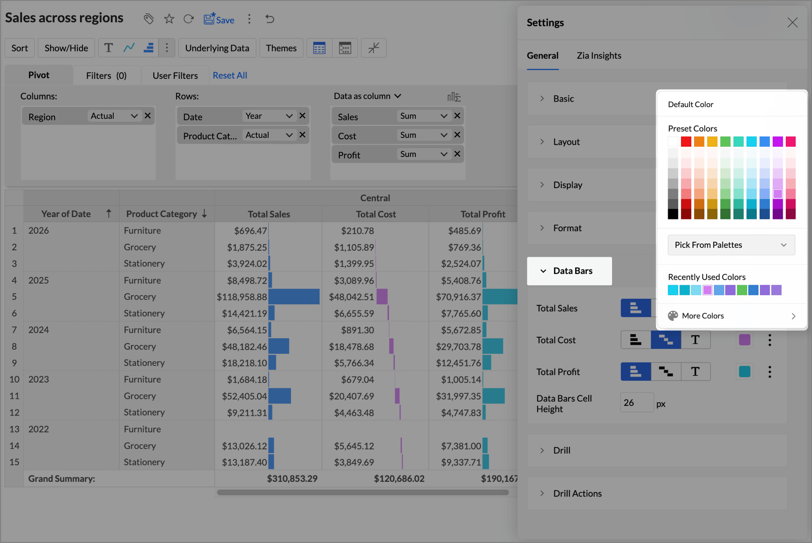
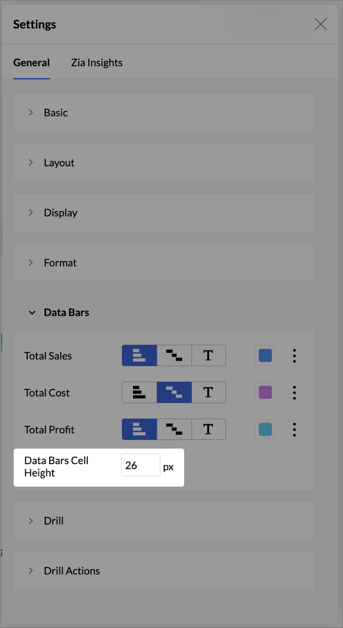
- At the top-right corner, click the Settings icon. Settings page will open.
- Click Data Bars.
- You can use the following settings to adjust the appearance of the Data and Data Bars.
- Type: Zoho Analytics offers you the below Data Bars type.
- Bar: A standard horizontal bar representing the data with length proportional to the data value.
- Waterfall: Displays bars with progressive values used to show changes over time/stages/categories.
- Data: Displays only the data values.
- Color: Choose your preferred color for the Data Bars.
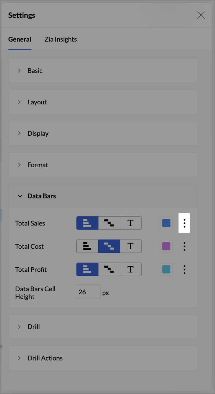
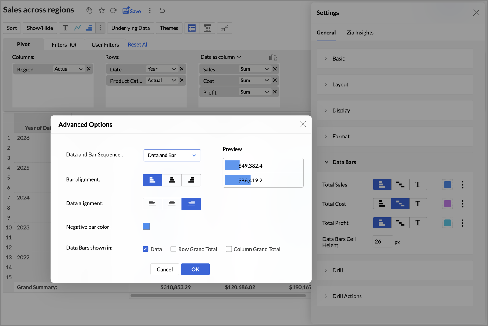
- Additional Formatting Options: Click on the Ellipsis icon to access the Additional Options window.
- Data and Bar Sequence: Click the drop-down to choose the display sequence between Data and Bar. This option is only enabled when the Data Bars With Data option is selected. Zoho Analytics provides the following options:
- Data and bar – Displays the data first, followed by the bar.
- Bar and data – Displays the bar first, followed by the data.
- Overlapped – Displays the data overlaid on the bar.
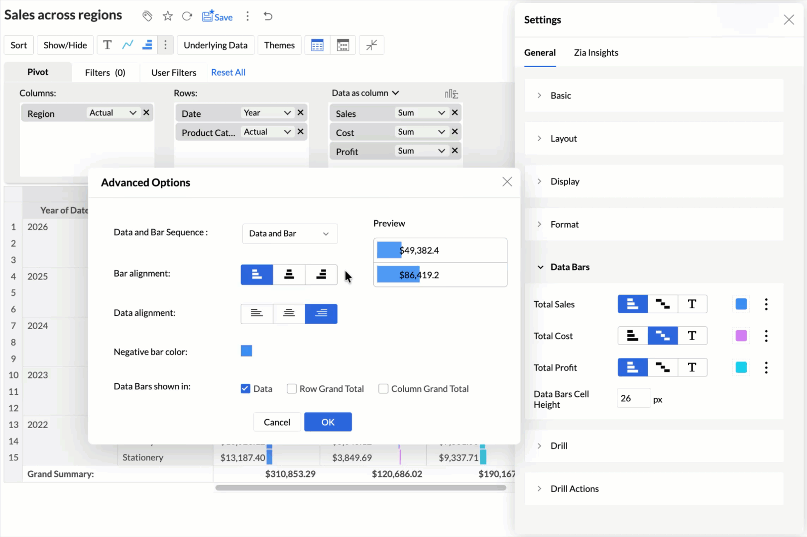
- Bar alignment: When Bar type is selected, you can align the bar either left, right, or middle. When Waterfall is selected, you can align the data bar either left or right.
- Data alignment: When the Data Bars With Data option is selected, you can set to align the data either left, right, or middle.
- Preview: The Preview space allows you to instantly see how different Data and Bars alignment or sequence appear in your pivot table.
- Negative bar color: Choose your preferred color for the data bars having negative values.
- Data Bars shown in: Select checkboxes to show Data Bars in Data, Row Grand Total, and Column Grand Total.
- Data and Bar Sequence: Click the drop-down to choose the display sequence between Data and Bar. This option is only enabled when the Data Bars With Data option is selected. Zoho Analytics provides the following options:
- Enter your preferred height value in pixels for the cells of Data Bars in the Data Bars Cell Height box.
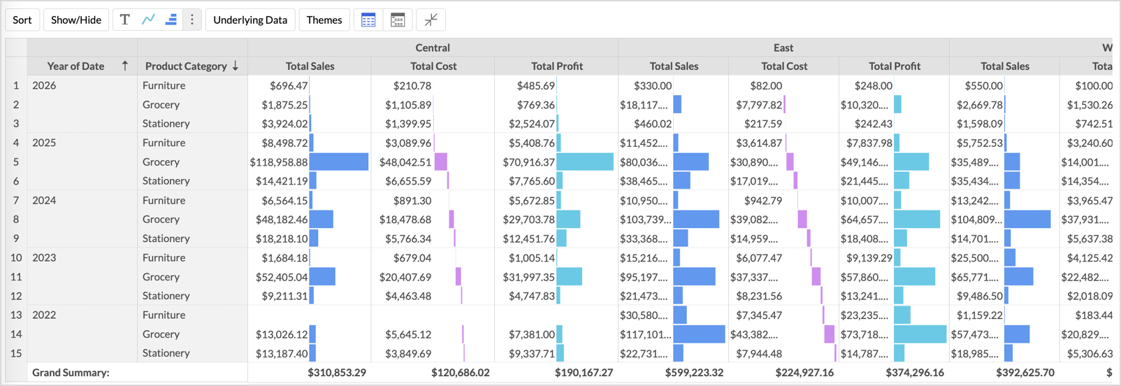
- After customization, the data appears as follows:
- Type: Zoho Analytics offers you the below Data Bars type.
Formatting Combined Visuals (Data Bars with Sparkline)
When you select Data Bars with Sparkline, the formatting options are available under the Visuals section in the Settings panel.
- Click Settings icon at the top-right corner.
- Open the Visuals tab.
- For each data column, choose the required visual.
- Customize the color and cell height as needed.
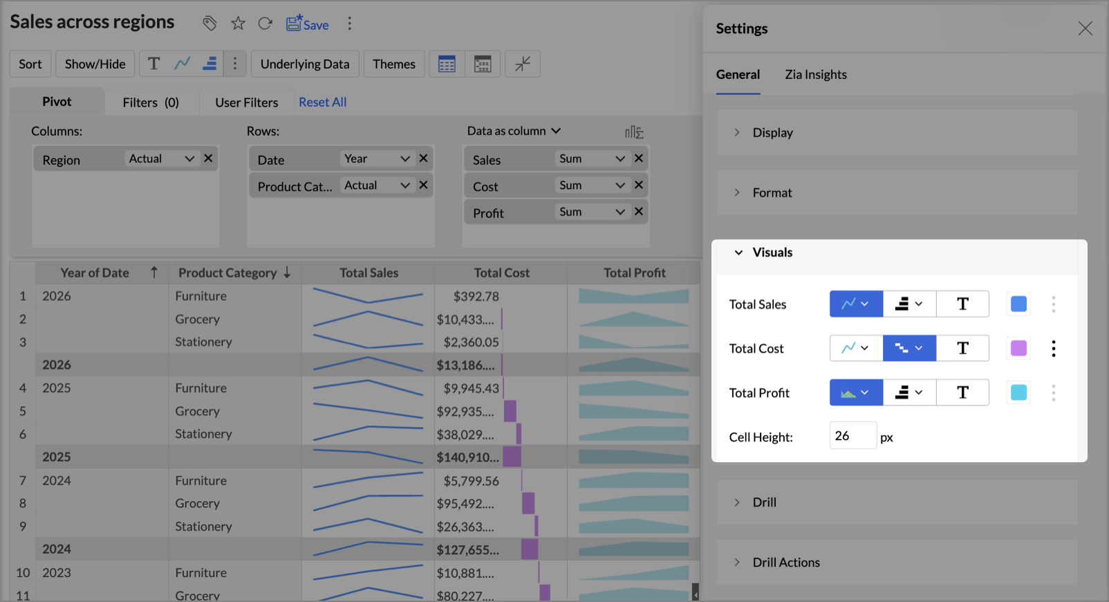
The pivot table updates instantly to reflect the changes.
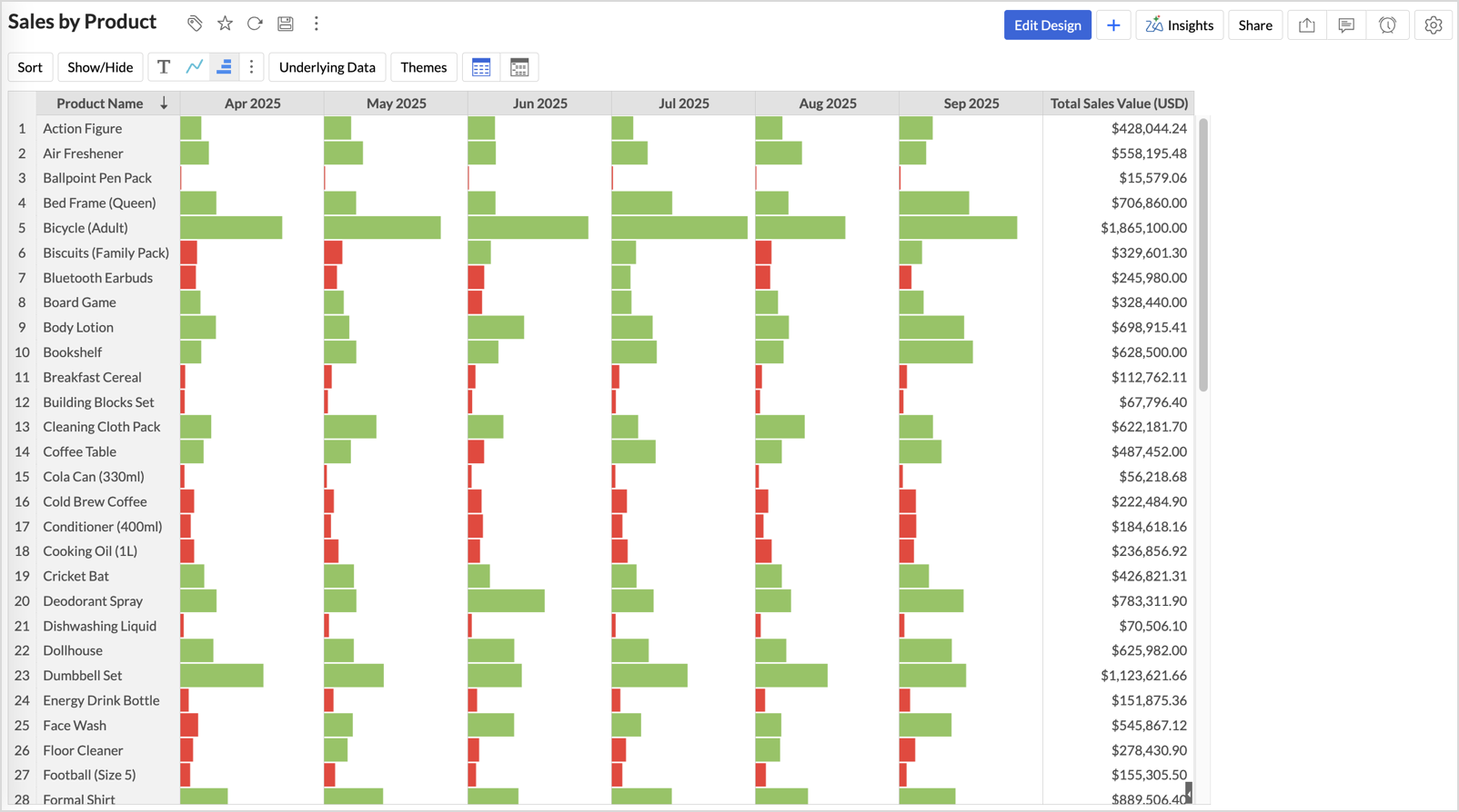
Conditional Formatting for Data Bars
Zoho Analytics allows you to apply conditional formatting directly on Data Bars. This lets you highlight bars that meet specific conditions, making it easier to track outliers or key thresholds at a glance.
To apply conditional formatting:
- Right-click on any data cell and select Conditional Formatting.
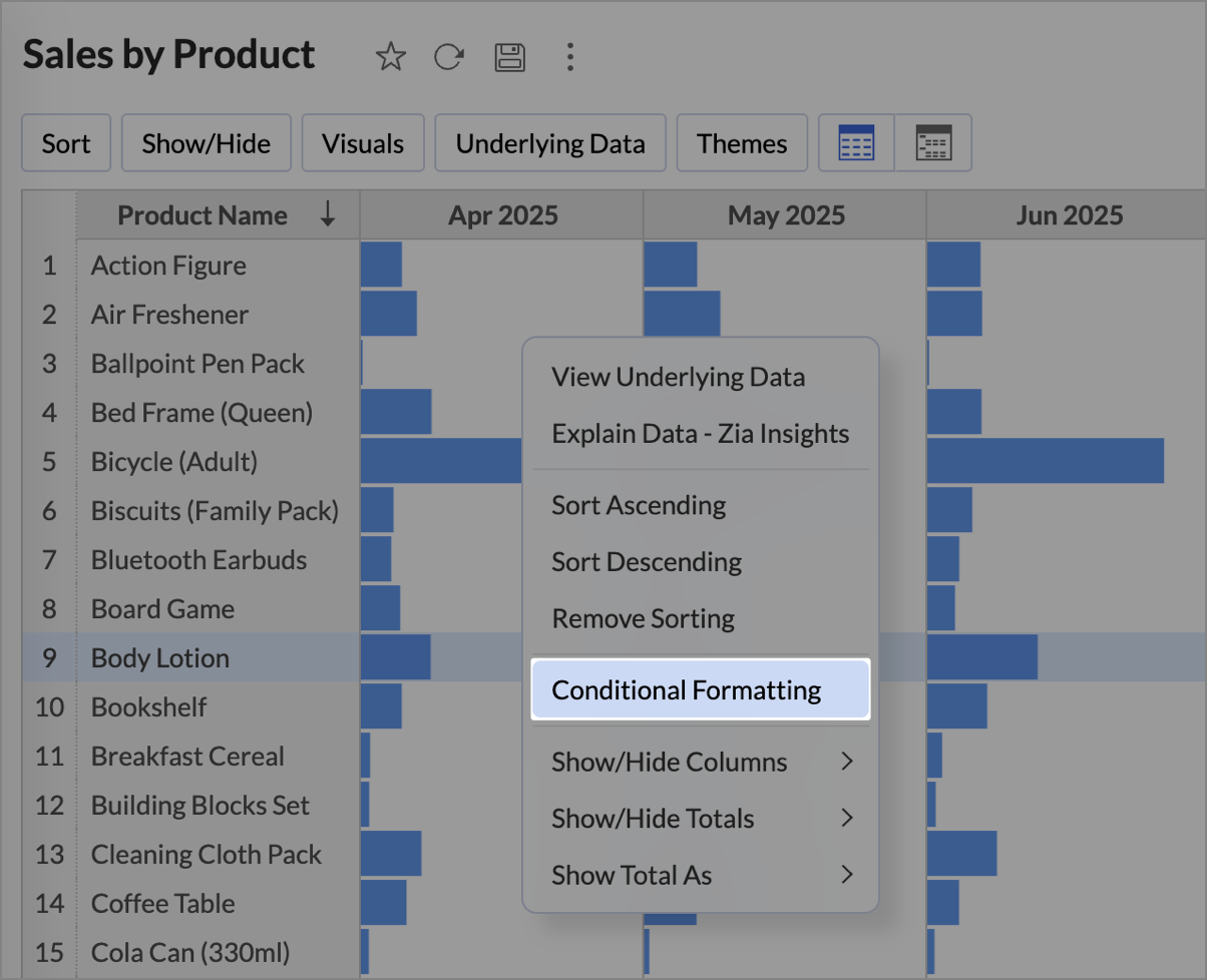
- On the Conditional Formatting dialog, define the rules based on your criteria.
- Choose a color for the Data Bars that meet the condition.
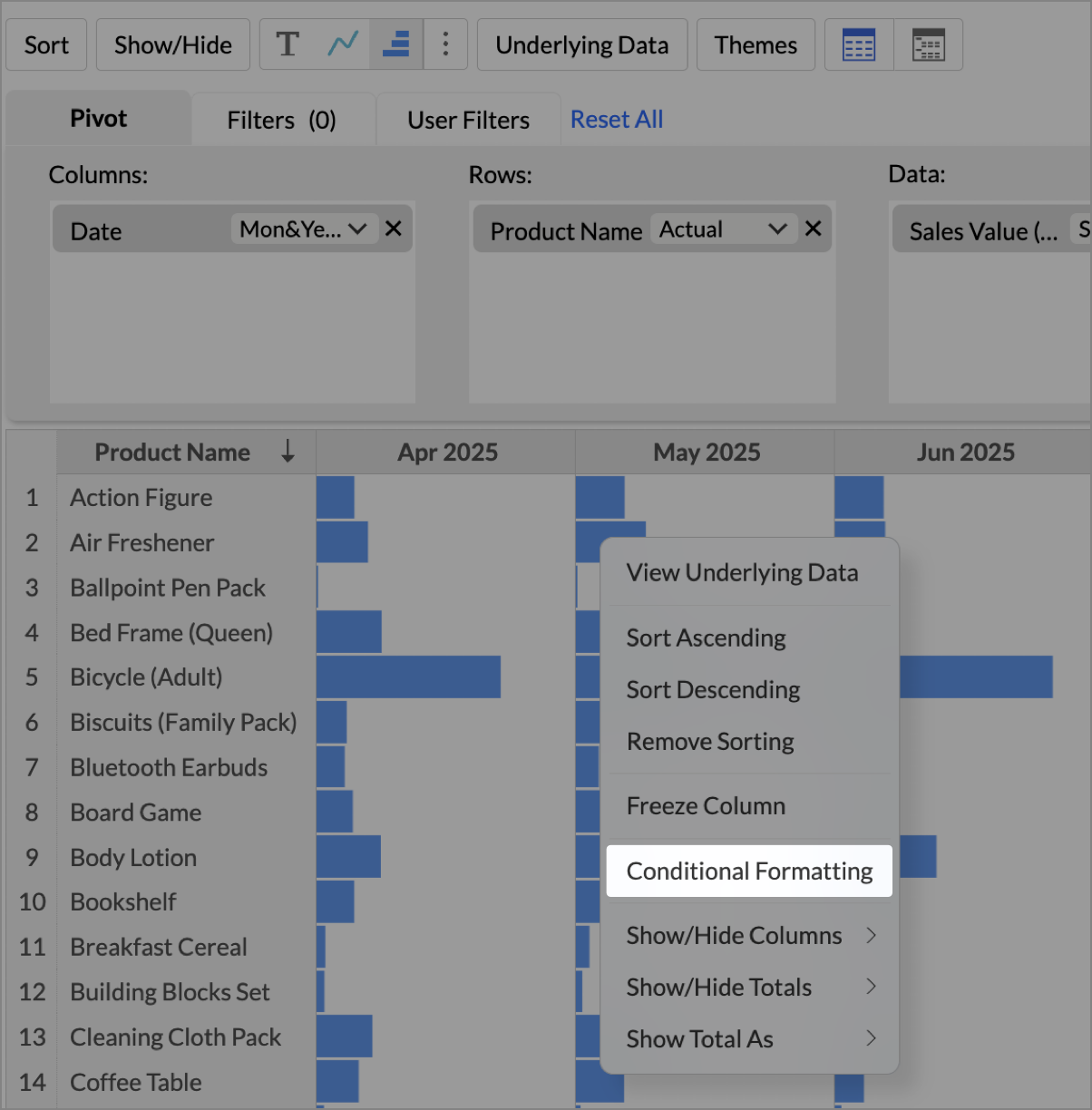
- Click OK to save the changes.
The Data Bars in your pivot will now change color dynamically based on the conditions you set, giving you deeper insight without losing the visual comparison of bar lengths.
Note:
- The data values are grouped based on the dimensions of the column shelf. When multiple dimensions are dropped in the column shelf, a Sparkline chart/Data Bar will be grouped and generated based on the last dimension in the column shelf.
For instance, if Date(Year) and Date(Month) is dropped in the column shelf, then the the sparkline chart/Data Bar chart is shown across Months for each Year. - During export, only the HTML format supports the Sparkline chart and the Data Bars.