Choose your chart.
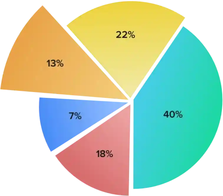
Want to create an exploded pie chart to study the contribution of various costs in manufacturing a product, or compare the growth of your company to competitors using a line chart? With Show's collection of 25+ chart types, you can visualize your data to provide better insights.
Learn moreDesign charts your way.
Customize charts to meet your specific needs.
Placement is key.
Wondering if a little space between your data sets or placing labels in a different position will make your chart look better? With Show, you can do all this and more—customize data sets using gap width and overlap features, or position labels anywhere on the chart. You can even reverse the axes to suit your data.
Learn moreAdd zest to your chart.
Make your chart vibrant and exciting with different colors, pictures, and gradients for backgrounds, or add emphasis to the chart by using the stroke feature. Experiment with each element in Style to bring out the best from your chart.
Learn moreDeliver information with panache.
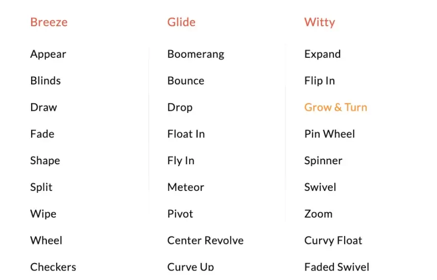
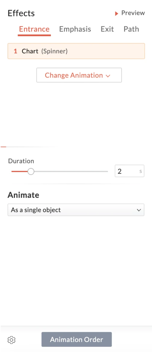
Transform your charts into an effective and persuasive decision aid using animations. Sequentialize the data by animating chart elements to control the flow of information and keep your audience captivated and focused on you and the presentation.
Learn more




Import existing charts.
Have presentations you want to reuse? Just upload them in .ppt or .pptx format to Show. Charts in the presentation will have all their characteristics retained and you can now customize them to your heart's content.
