Customizing a Chart
A visualization must be easy to interpret, with key insights quickly conveyed at a glance. To achieve this, Zoho Analytics offers extensive customization options that allow you to tailor the chart's appearance, ensuring it is not only visually appealing but also clear and informative.
On this Page
- General Settings
- Overview
- Axis Settings
- Borders and Colors
- Format
- Legend Settings
- Adding Threshold
- Drill Capability
Watch the below video to get an overview.
How to Customize a chart?
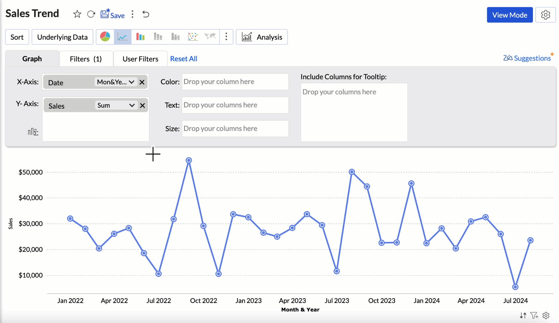
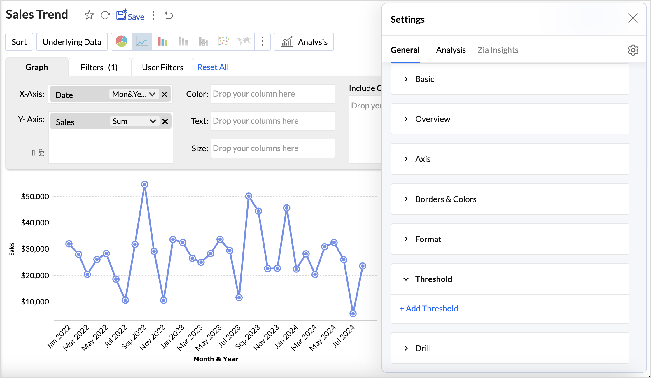
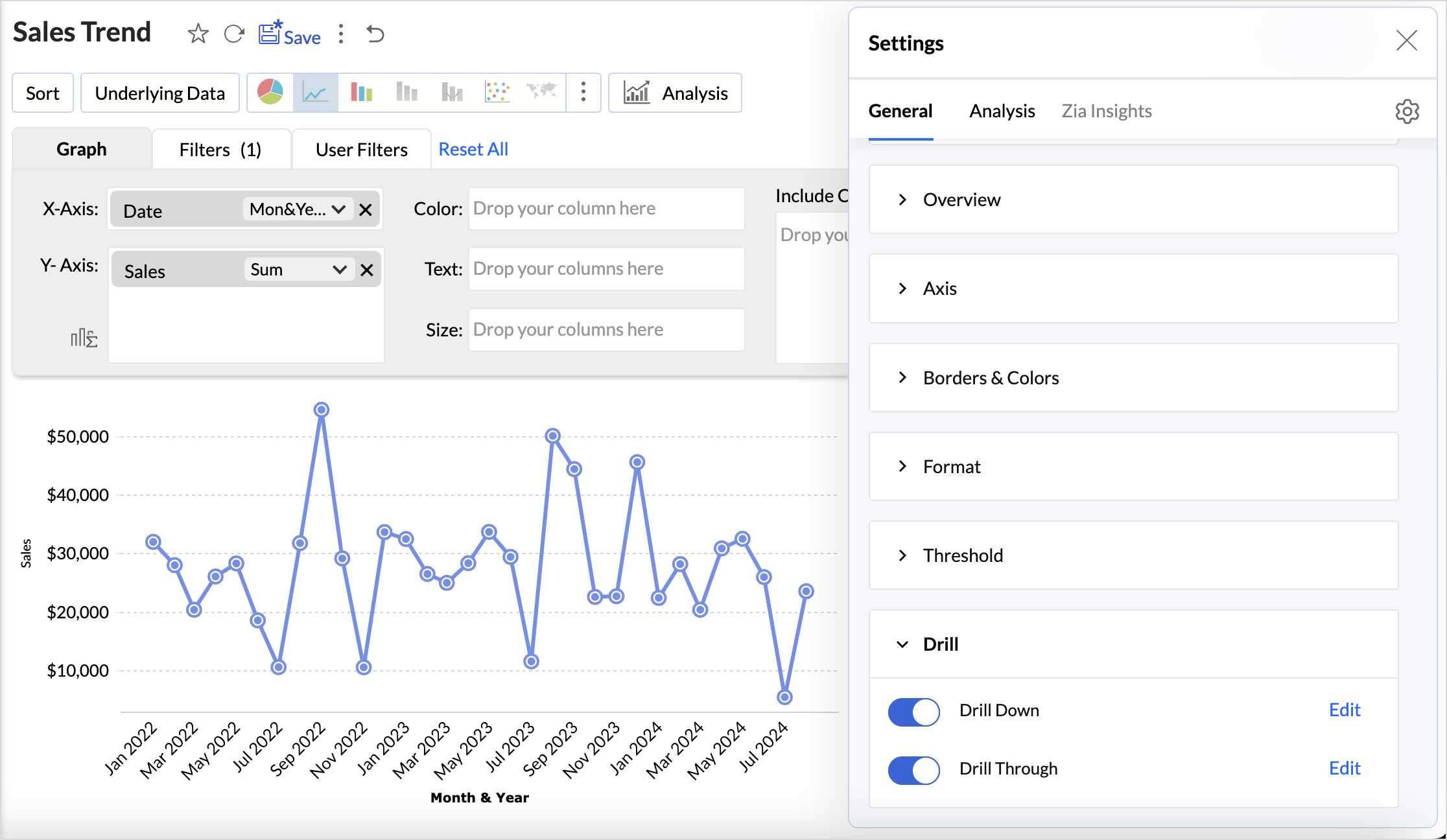
Once you have dropped the required fields to their corresponding shelves, click the Settings icon in the top right corner.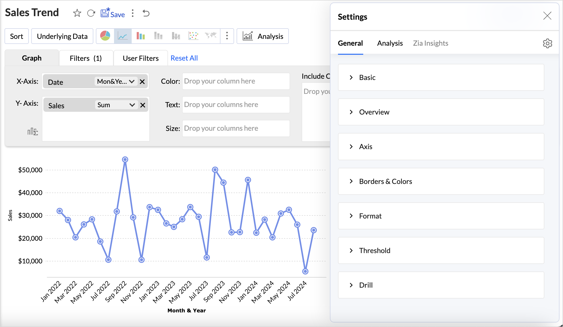
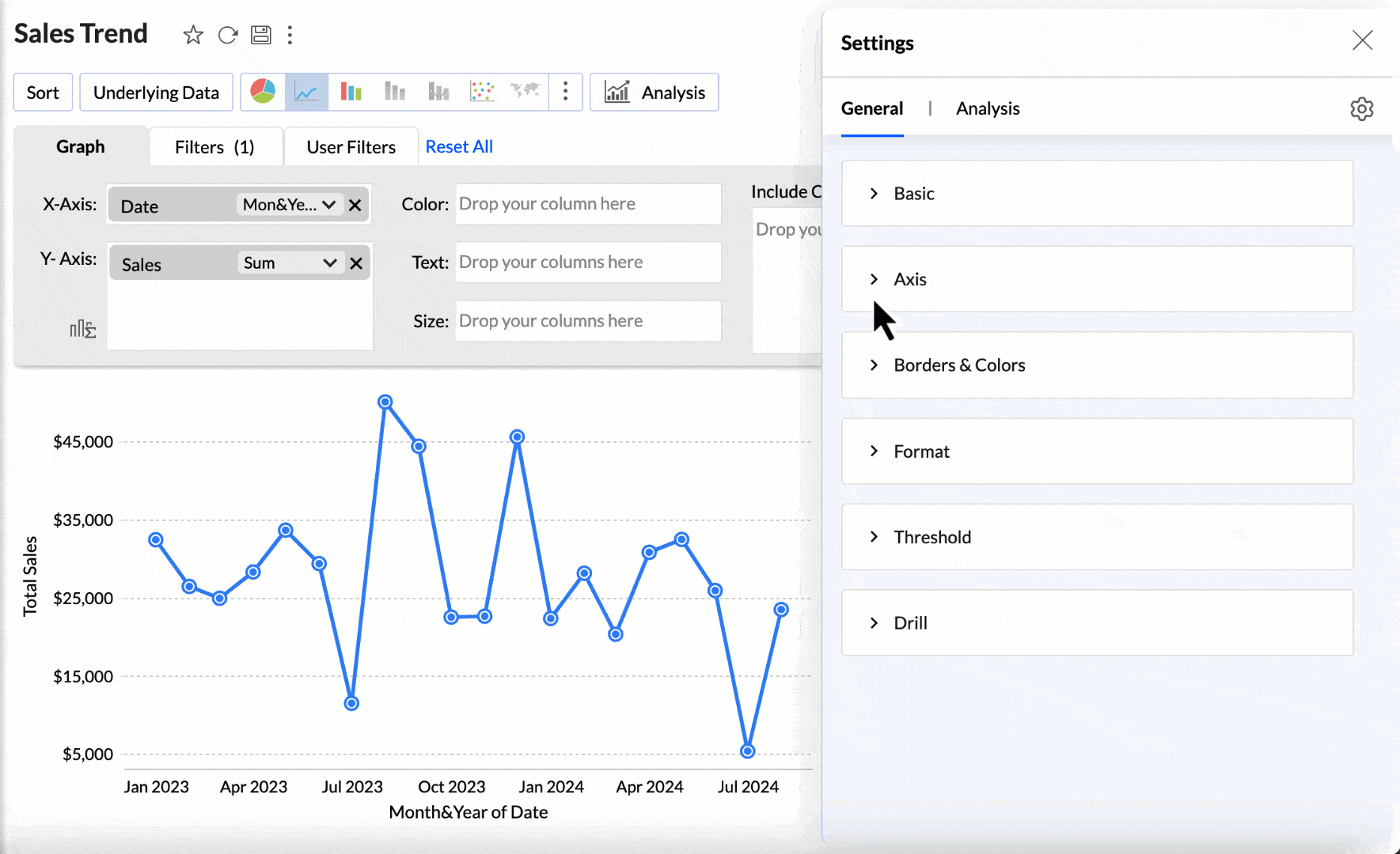
The Settings pane comprises of the following three elements
- General
- Analysis
- Applied Settings
General
This tab displays all the general chart settings, along with the settings specific to the selected chart type.
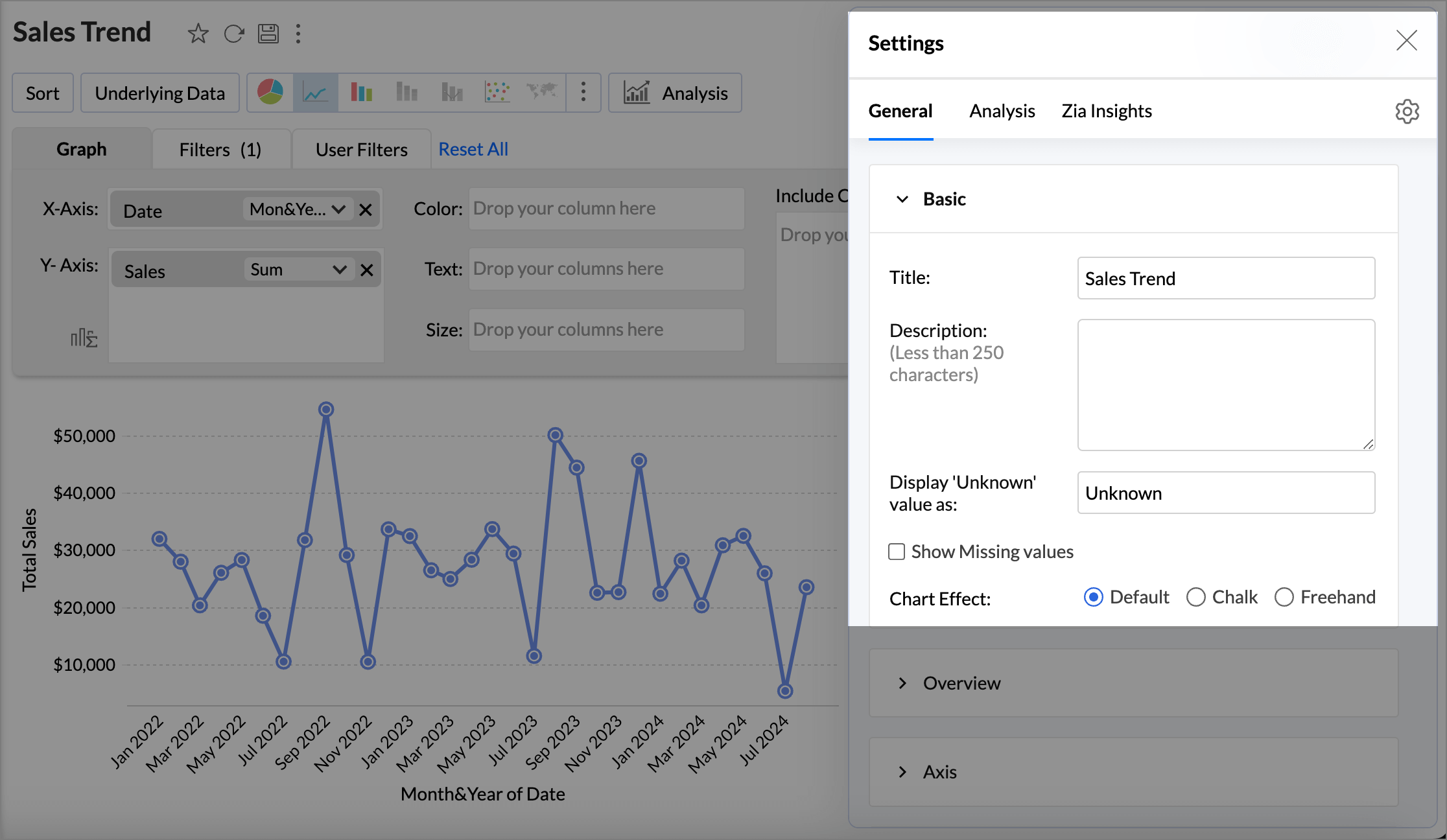
Basic Settings
This section allows you to customize the elementary details about the report, such as the Title,Description, how to represent the Missing values in the report, and other chart specific options.
- Specify what data should be displayed for null or empty values in the Display Unknown Value.
- Select the checkbox Show missing values to plot the chart including the data points (dates/categories) that do not have any corresponding value in the underlying data. Deselecting this will skip these points in the axis.
- Choose the chart effect to be applied.
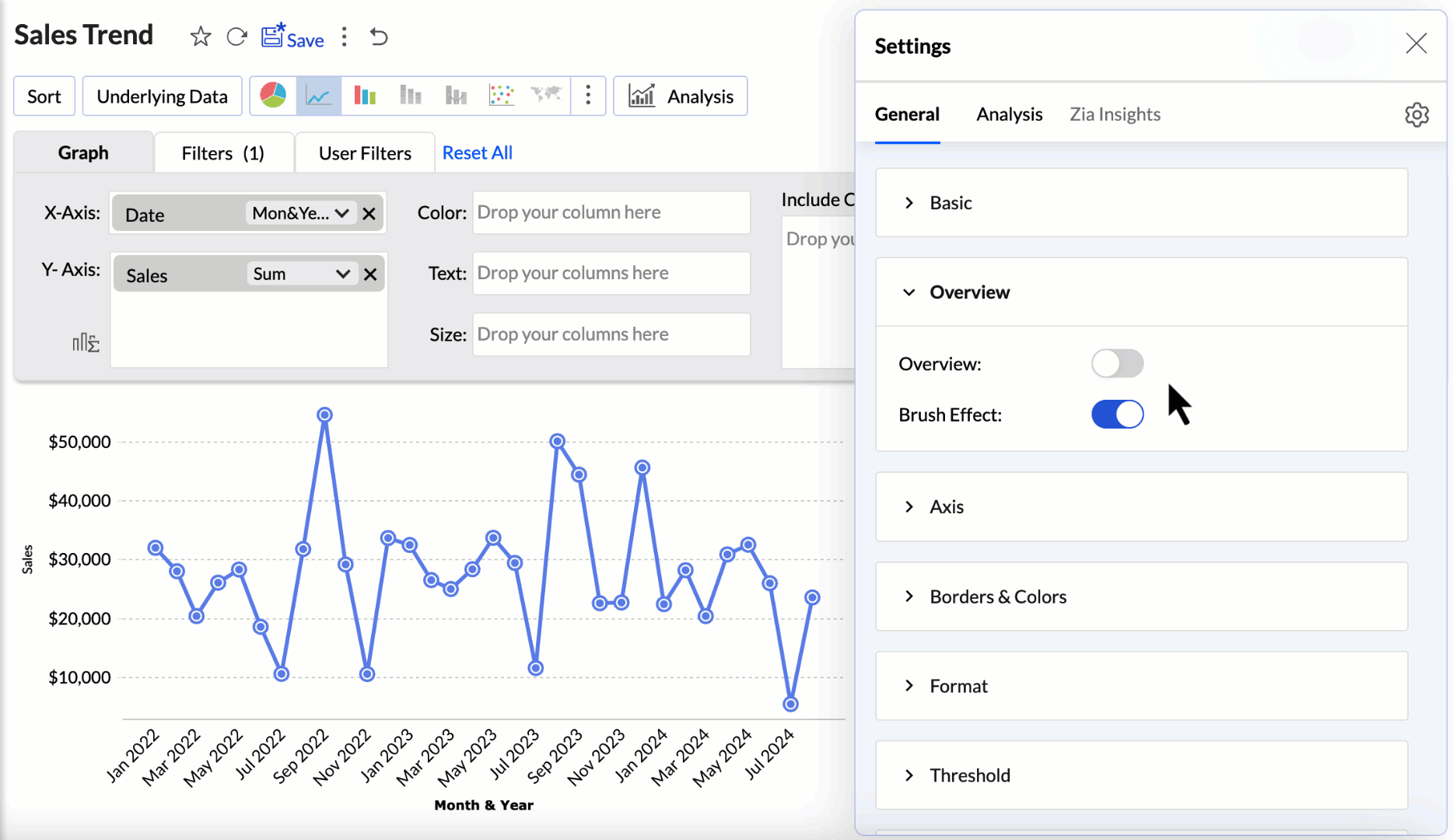
Overview
- The Overview effect are beneficial for charts that have many data points. It helps to select a specific section of the chart to understand the leaps and bounds clearly.
- The Brush effect allows users to select, highlight, and explore specific portions of a chart by brushing over the data. This effect enhances data exploration and visualization by enabling dynamic filtering or zooming into selected areas.
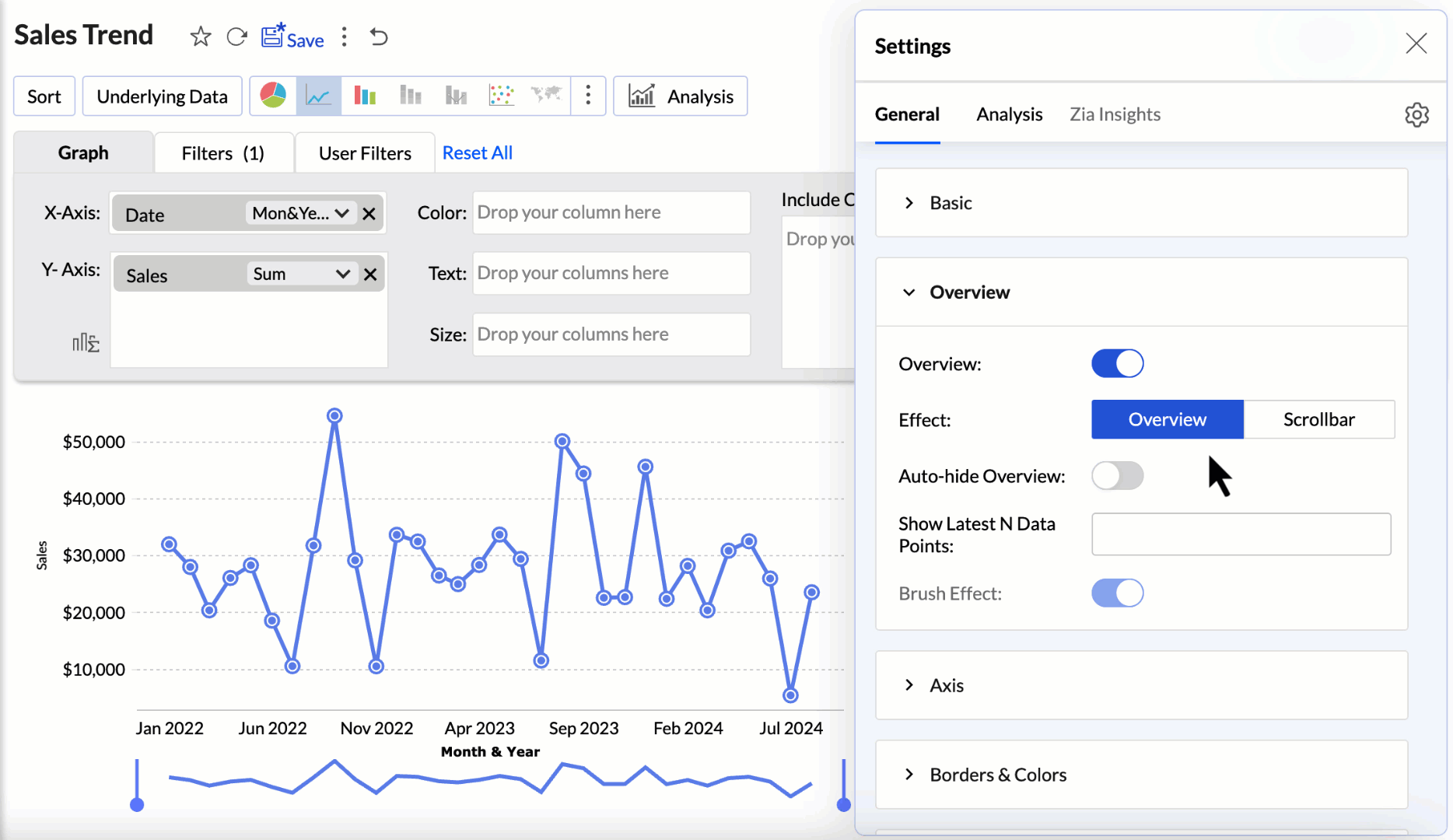
Overview Effect
The Overview Effect adds a preview to the bottom of the chart. You can adjust the slider in the overview chart to focus on a particular region of the chart for in-depth analysis.
- Enable the Overview toggle button and choose the chart effect to be applied.
- Enabling the Auto Hide Overview option hides the overview panel and displays it only on hover.
- The Show Latest N data points displays only the specified number of data points while applying the overview effect. This option is available only when a date dimension is used in the report (x-axis).
Scroll Bar Effect
The scroll bar offers smooth horizontal movement through the data, helping users focus on different sections without needing to compress the entire dataset into one view.
- Adjust the slider to choose the Category Thickness or specify a value.
- Enable the Brush Effect to select, highlight, and explore specific data points or ranges within the chart.
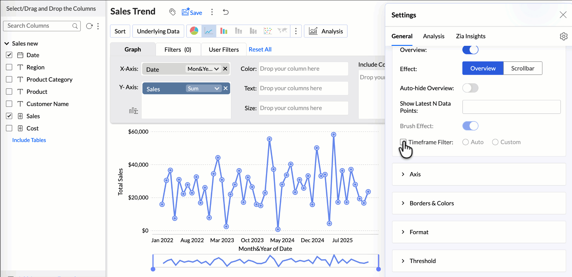
Timeframe Filter
The Timeframe Filter lets you choose the time period for data visualization in an overview chart, helping you analyze trends across specific durations.
- Auto: Selects an appropriate timeframe automatically based on the available data in the chart.
- Custom: Allows you to manually define a specific date range, including both past and future periods.
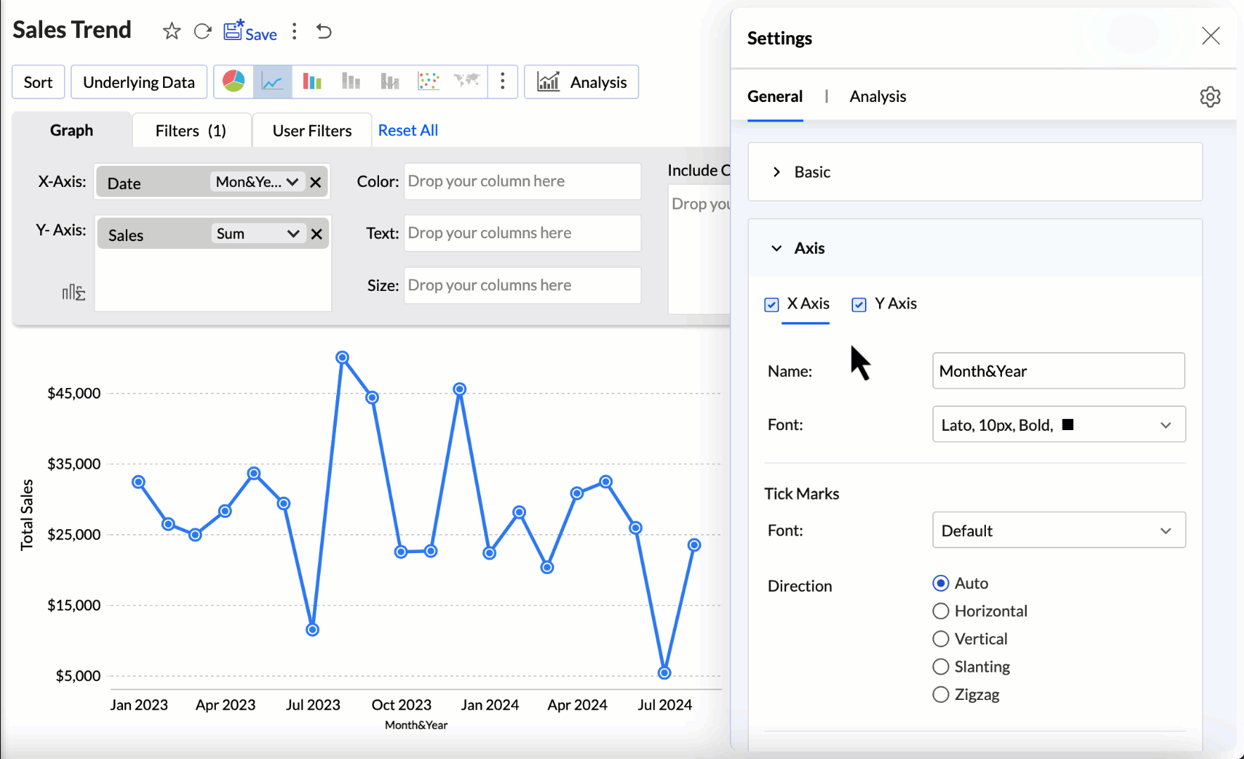
Axis Settings
Zoho Analytics automatically sets the label, range, and intervals for the X and Y axes while generating a chart. These settings can be customized as needed.
X-Axis
Follow the below steps to customize the X-axis settings, navigate to the Axis tab, and choose X-axis.
- Label: Customize the Name of the X -axis. By default, the name of the corresponding column is applied as the axis label. Choose the Font style, size, and color of the x-axis label.
- Tick Marks: Choose the Font style, size, and color of the tick marks and the Direction in which the tick marks should be displayed. Available options are:
- Auto - Align the tick labels in the most appropriate direction based on the number of characters in the tick label.
- Horizontal - Align the tick labels in a horizontal direction.
- Vertical - Align the tick labels in the vertical direction (90-degree angle to the axis).
- Slanting - Align the tick labels in the slanting direction (45-degree angle to the axis).
- Data Label: This option can be used to display Y-axis values as data labels in the chart. On selecting this option, a text string which displays the Y value corresponding to each data point will be added.
Y-Axis
- Label: Customize the Name of the Y-axis. By default, the name of the corresponding column is applied as the axis label. Choose the Font style, size, and color of the Y-axis label.
- Tick Marks: Choose the Font style, size, and color of the tick marks and the Direction in which the tick marks should be displayed. Refer to this section to learn more.
- Scale: This option allows you to specify how to scale the label ticks. Available options are:
- Linear - Adds tick in linear number sequences as 100, 200, and 300 with equally spaced grid lines.
- Log - Adds tick in log number sequences as 10,100, 1000 with equally spaced grid lines.
- Square Root - Adds tick in square root sequences as 5, 25, 625 with unequally spaced grid lines. Spacing between the grid lines decreases as value increases.
- Range: Zoho Analytics will automatically calculate the Y-axis range based on the maximum and minimum values in the data series. Enable the checkbox Range to specify the minimum and maximum values.
- Interval: Enable the checkbox Interval to customize the interval between the ticks label.
Borders and Colors
When a chart is created in Zoho Analytics, a default background color and border colors are applied. These settings can be completely customized to enhance the chart appearance.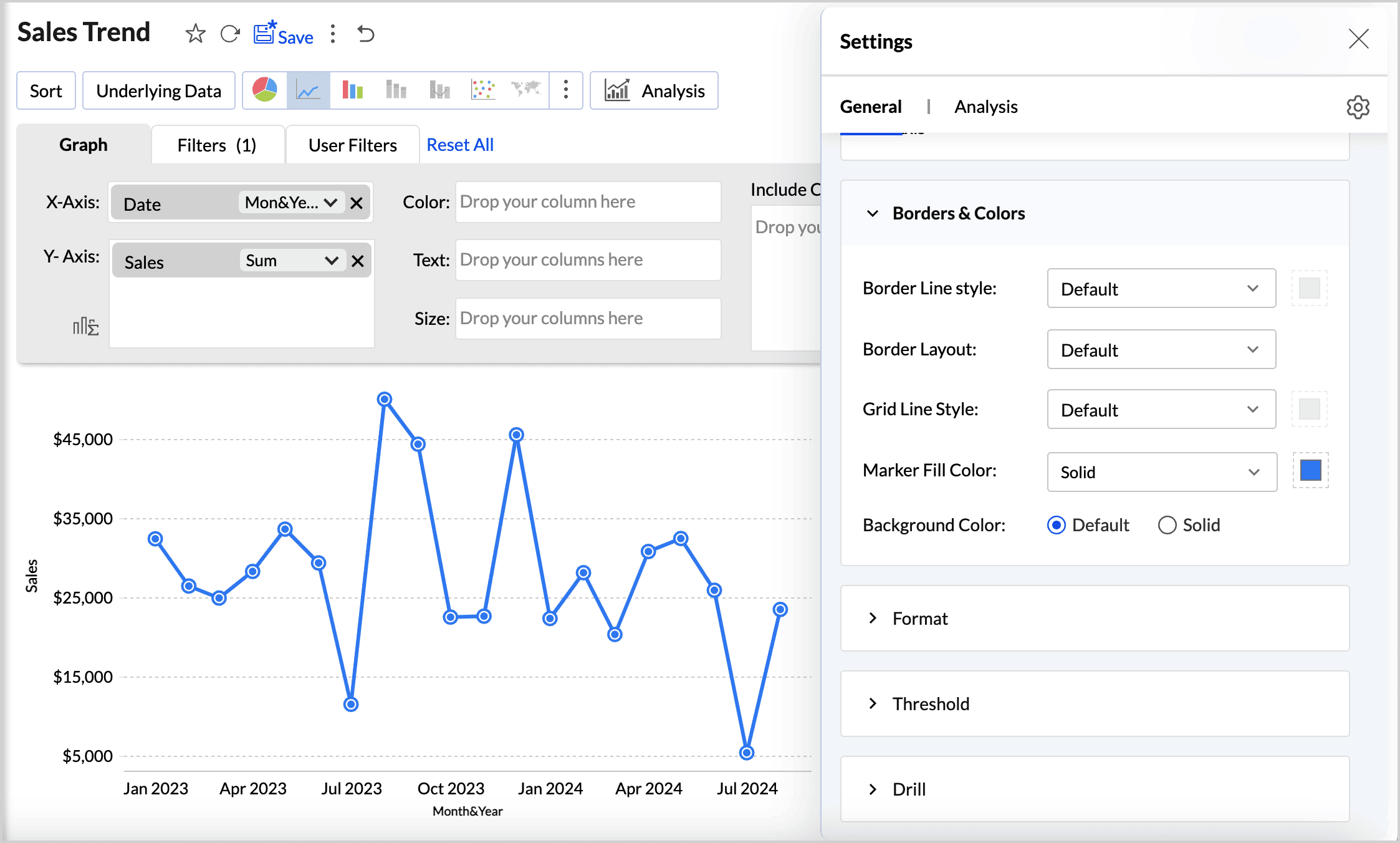
Access the Borders and Colors tab to customize the below settings,
- Border Line Style: Choose the line style and the color to be applied from the Border line style drop - down menu.
- Border layout: Choose the Border Layout to be applied from the drop - down menu. The Default option applies a thin gray border at the bottom of the chart.
- Grid Line Style: Choose the Grid Line style and the color to be applied from the drop- down menu.
- Marker Fill Color: Choose the marker fill color and the style to be used for the chart.
- Background Color: This option can be used to apply a background color to the chart. The default option does not apply a background color. Choose Solid option to pick the color if needed.
Format
Using the right format is imperative for both analysis and interpretation of the data. Zoho Analytics provides many options to format a column based on the data type. This helps ensure all the data points in the column have the same consistent format.
Access the Format tab to customize the following settings,
- The columns in the X-axis and Y-axis of the report will be listed, along with the Format option on the right.
- Click Format. The options listed are specific to the data type of the column. Refer to the Format a Column article to learn more.
- Specify the preferred format.
The format can also be applied from the report editor.
- Click the Settings icon that appears on hover and choose Format from the drop menu.
- Make the required modification and click Ok.
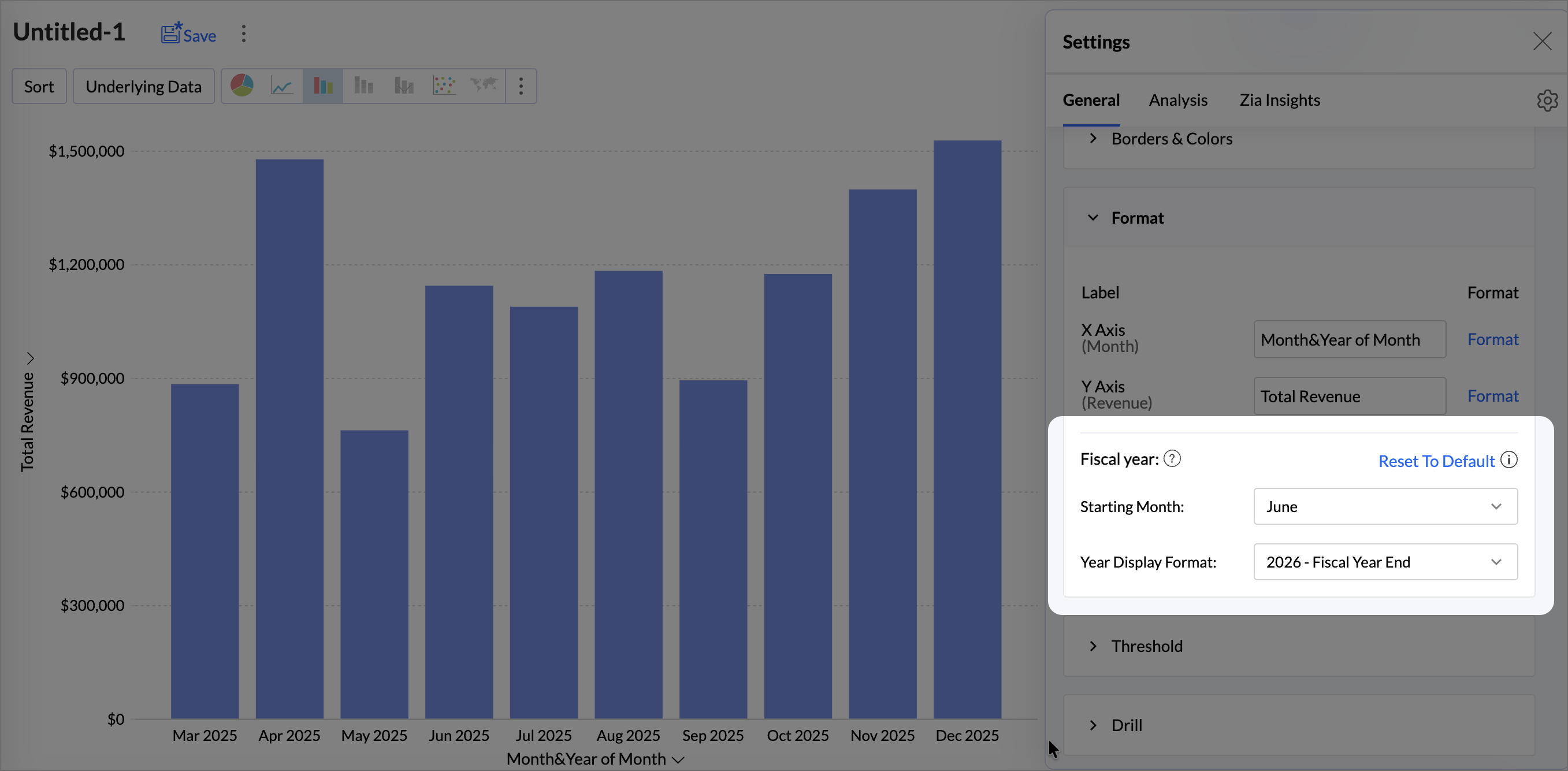
Report Level Fiscal Year Settings
The Fiscal Year setting in the chart options allows you to define the starting month for the fiscal year. This customization applies solely to the current report. This option is shown when a date column is used in the report.
To customize the report level fiscal year settings,
- Click Format.
- Under the Fiscal Year setting option, choose the Starting Month.
- Customize the Year Display Format.
Legend Settings
The legend in a chart provides a quick overview of the different data series involved in the chart along with the color associated with each series. Legend consists of Legend Title and Legend Items. Each legend item consists of a colored box that indicates the data series and the name of the data series.
In Zoho Analytics, by default, the legend will be placed on the right side of the chart and legend items will be added to it depending on the data series involved in the chart. You can customize the legend position, legend title, legend filters and the colors of each data series easily.
To customize the legend:
- Open the corresponding chart and click Settings option in the toolbar.
- The Settings screen will open. Click the Legend tab.
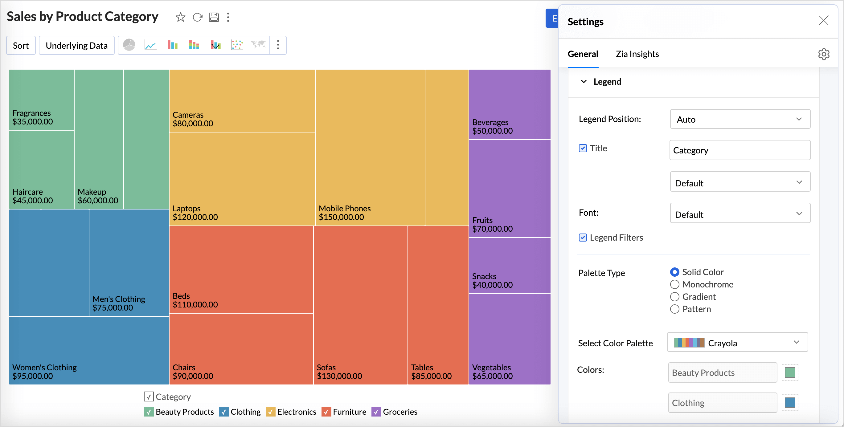
- The Legend tab provides various options to customize the legend properties. Set the options as required.
The following table describes the options available in the Legend tab:
| Option | Description |
| Legend Position | This option allows you to set the position of the Legend in a chart. Supported positions are:
|
| Title | This option has two fields. The checkbox allows you to show or hide the legend title. In the text field, you can change the default title of the legend. You can also customize the font style of the legend title. |
| Font | Using this option you to customize the font style of the legend items. |
| Legend Style | Specify whether to display the legend items with or without the corresponding values. You can also customize the format to display data using the Format link. |
| Legend Filters | Select this option to enable legend items to act as filters in chart view mode. This allows users to dynamically filter the data series using the legend items. Refer here to know how to use the Legend filters to filter a data series. |
| Palette Type | Select the Palette type. Zoho Analytics offers three types of palettes. They are:
|
| Color Palette | Select the color palette to apply color for your data series. You can also select a color palette based on the palette type that is selected. Zoho Analytics has a predefined set of color palettes that you can choose from. Apart from this, you can also add new color palettes. |
| Colors | Using this option, you can override the colors of the individual series of the chart. Once you override the palette, you will find the following options.
|
You can also change the color of each data series using the corresponding legend item in chart Edit Mode. Refer to the Customizing Chart Colors section to know how to customize chart color using a legend.
Threshold
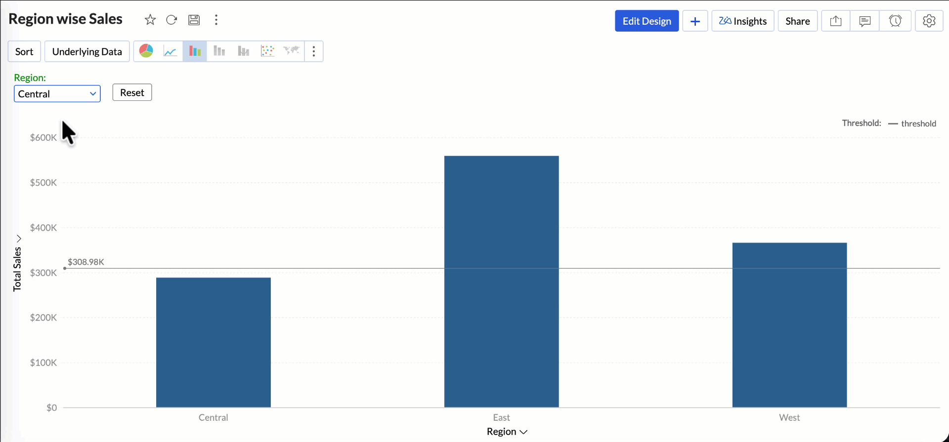
Zoho Analytics provides you with an option to draw threshold lines in a chart to highlight specific values. Threshold lines can be added horizontally or vertically at a fixed value on the X or Y-axis of a chart. A threshold will be useful to highlight specific values for better visualization and for comparing the data series.
For example, you can set a threshold line to represent the maximum sale target, and another to represent the lowest acceptable sales target to spot regions that are out of the sales target easily. Zoho Analytics allows you to add two types of threshold lines - Static and Dynamic Threshold lines.
Static Threshold
A Static Threshold allows you to set a fixed, constant value as a reference line on your report or dashboard. With Static Thresholds, you can easily identify how your metrics are performing relative to a predefined target. Any data point above or below this set value can quickly highlight performance gaps, trends, or exceptions.
Dynamic Threshold
The Dynamic threshold allows you to apply dynamic functions such as Sum, Average, Minimum, and Maximum over the columns in your reference axis or over a different column.
Aggregate formulas can be used with variables inside thresholds. When these formulas are combined with User Filters, the threshold value is recalculated dynamically based on the user’s filter selection ensuring that every user sees threshold boundaries that are relevant to their applied context rather than a fixed value.
How to ddd Threshold to a chart?
- Access the Threshold option from the settings tab and click Add Threshold.
- Select the Scope of the Threshold; the available options are
- Entire Table: Applies the same threshold for the entire table.
- Per Cell: Applies a threshold for a single cell. This option is recommended while creating dynamic thresholds. It is not applicable for charts with multiple columns in the Y-axis.
- Select the reference axis from the Reference Axis drop-down.
- Select Constant from the Value drop-down and enter a value.
- Enter the desired name of the threshold line in the Name text box.
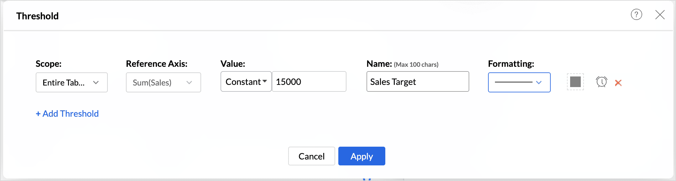
- Select the line type and color from the Formatting drop-down.You can also Create Alerts based on threshold.
- You can add more thresholds using the +Add Threshold link.
- Click Apply once you have added required threshold lines.
Drill Capability
The drill capability allows you to view data at different levels of granularity. Facilitates comparison between different segments of the data.
Drill Down
The (data) drill feature in Zoho Analytics enables you to get the granular details in a report. It helps to get insights from the specific categories or sections of the data.
The following are the steps to define a drill path for a chart:
- Click the Settings icon in the top right corner.
- Enable the Drill Down toggle button.
- Define the drill-down paths for the report.
- The Allow Dynamic Drill Down option helps users who access the report drill down by choosing any column used in the chart.
- Additionally, the drill function for the measure columns can also be customized as needed. Enabling the Show options to alter Scale type allows users who access the report to change the scale type (Linear, Log, and Square root) of the report.
- Enabling the Show options to apply Window functions on the measure column allows users to change the advanced summary functions (Running Total, % of Total, Difference From, % of Difference From, % of Previous Value) used in the report.
Drill Through
The Drill through action enables users to navigate and view the reports related to the current data point. This action helps link all the related reports specific to metric or dimension.
For example, if the report Region wise Sales indicates that the East region has contributed most to the sales, and you want to know the product level sales for that region.
You can configure a drill through action between the Region wise sales report and Product wise sales report to get a complete picture of which specific products are driving the high sales in the East region, allowing you to analyze the performance at a more granular level.
The drill through action can be configured for all the visualizations (Chart, Pivot view, Summary view, tabular view, and dashboards).
Passing Parameters in Drill Through
When a user performs a drill-through action, the selected data point’s values are automatically passed as parameters (filters) to the target report. This ensures that the destination report displays data relevant only to the selected context.
- The values of the selected dimension(s) (for example, Region = East) are passed as filter parameters.
- These parameters are applied to matching columns in the target report.
For example, clicking on East in a Region-wise Sales chart passes Region = East as a parameter to the Product-wise Sales report, which then displays product-level data only for the East region. This dynamic parameter passing enables seamless contextual navigation and deeper analysis without requiring manual filtering.
Configuring a Drill Through Action
- Click the Settings icon in the top right corner.
- Enable the Drill Through toggle button.
- Select the views to drill through from the report. Drill through lets you open another view from this chart, passing the selected data point(s) as filter. All the views created over the chosen table and its related views are listed for selection. Only the views created over the same chosen table and the related tables are listed.
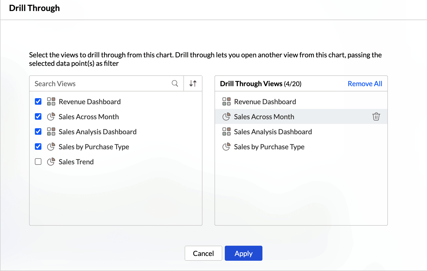
- Click Apply.
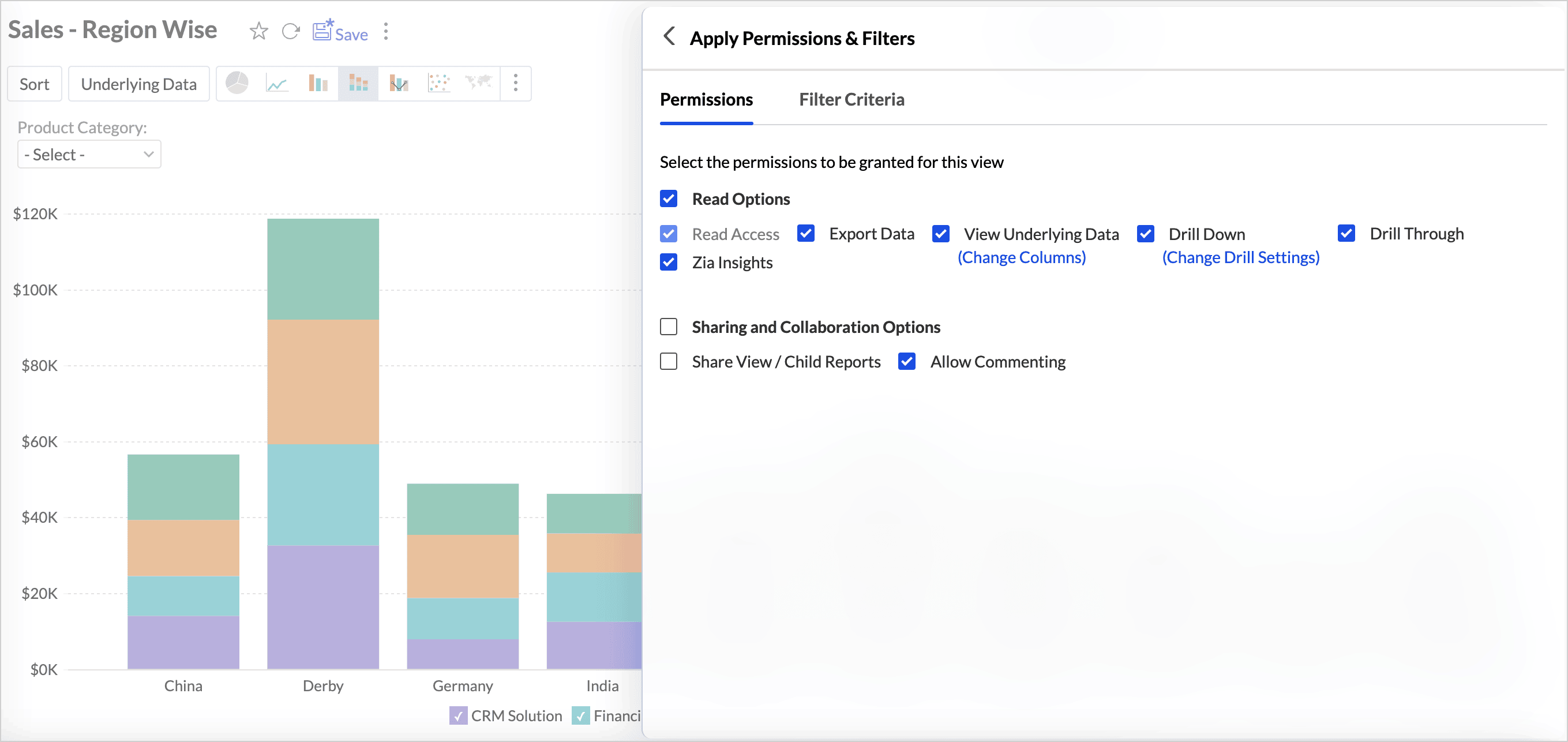
Drill Through Action Permission
Drill-through options are available in a report based on the user’s access permissions. Administrators have this capability by default. For other non-administrative roles, such as Users or Custom Roles, the Drill Down and Drill Through interaction permissions can be enabled while sharing the views.
This ensures that only authorized users can access the related reports opened through drill actions.
Drill-through actions are also supported for public views and embedded views. As with shared views, you must enable the required interaction permissions (drill through) when making a view public to allow users to perform drill actions.
When a user performs a drill-through action, the related reports open in a child or secondary window, allowing them to explore the underlying data without leaving the main view.